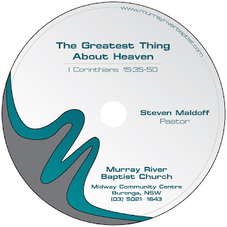
Have you ever had a great idea that turned into a better idea? Like a spark of genius that's so magnificent you couldn't pass it up? Well this is sort of like that, minus the genius part. On Monday I ran an article called Media Tip: Sermon Audio Promotion. In that article, I discussed various methods of getting your CD labels printed. Yesterday, our Design Inspiration for the week left me a little disappointed as to the quality of CD labels that are discoverable on the net. Because of this, I decided to design my own CD label for Murray River Baptist Church to come up with something professional. Here are my results.
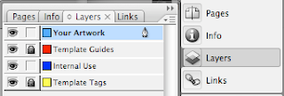
First, click on your layers palette and unlock the locked layers.
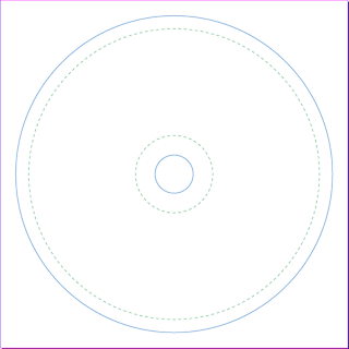
You don't need half of the margins and things they use, so delete everything except the bare minimum outlines as seen below.
Click back up to the "Your Artwork" layer, and let's begin working on the CD itself. Begin by making a new circle to match the blue guide leaving the outline black and the fill transparent for now. You will also need to create one for the inner blue guide. Make this one have a white fill with no outline.
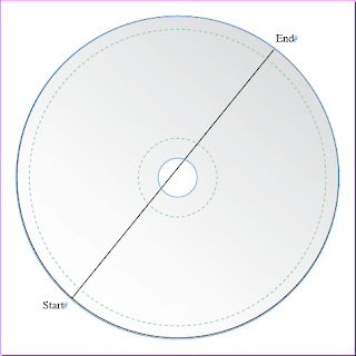
Next, we'll make a gradient across the background. Select the gradient palette. Choose linear. Set the colors to white on the left and 15% Black on the right. To do this, create a new swatch and set it at C=0, M=0, Y=, K=15. Using the gradient tool, click and drag from the start point, below, to the end point.
Now we'll create the inner circle. Make another circle, slightly smaller than the other one. If you have a printer that will print the label directly to the edge of the CD, then don't worry about the green line and make our circle just outside of it. Set the color to 20% Black using the same steps as above.
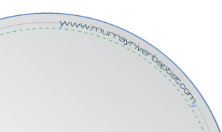
I chose to put the church website on the edge of the CD. You don't have to if you don't want to, but I think it looks nice. Copy the circle you just made, Cmd+C (Ctrl+C), and Paste in place, Cmd+V (Ctrl+V). Grab your Text on a path tool. If you've never used this, click and hold down the Text tool and you'll see the option appear. Now click on the path where the beginning of the text starts. Type in what you want. Go to the character palette, Cmd+T (Ctrl+T), and adjust the Drop caps setting so that the text drops down into the line.
Now, using the selection tool (black arrow), click on the layer and turn off the stroke. The first circle that you made should still be behind the text with the stroke present. Next you need to create a box with the pen tool to cover up a portion of the line behind the text. Mimic the picture below. You will need to place this box behind the text, but in front of the line. Adjust this using the shortcut Cmd+[ or Cmd+]. Set the fill to white so you can see what you are doing.
Next, with the box you just created still selected, shift click onto the gradient background you made, selecting both. Repeat the gradient step and this will make the box have a gradient flush with the background so that you will never even know it's there.
Add your logo or design in the corner. I tweaked this one a little bit to make it flow nicely off the CD, however if you scroll to the end of this tutorial, you'll see another CD I made for a different church that doesn't have this. You can do something similar to that if you don't know how to manually manipulate the logo.
I also added a gray fill behind the logo. You may decide to do something like this, or you may not. I used the pen tool to create a shape that fits underneath the logo and gave it a gray fill.
We're almost finished now. You just have to add your text. For the sermon titles, I made the name of the sermon bold and slightly larger in size than the Scripture passage. I adjusted the leading of the Scripture a little bit to add some extra space between it and the sermon title. Then I added a line using the Line tool and made the stroke the same 20% Black as the ring on the inside of the CD.
Then I added the church details, making sure the text fit inside the green line, just in case.
Finally, I added the Pastor's name, since he is the one who preached the sermon. I did not include a for sermon, you could do that if you like, I just didn't know where to put it without cluttering up the nice design, so I left it out. You aren't likely to preach the same sermon again, and even if you do, would you need a different CD?
Here is the finished product.
Also, here is the other CD label I designed with a different logo that I told you about earlier.
If you liked this tutorial, or found it useful. Please let me know. I will try to make some more tutorials in the future, sharing with you how I do what I do so that you, too, can do it. I would also encourage you to share this tutorial on Facebook or Twitter. You never know if one of your friends could use this tutorial right now.

 2:00 PM
 T.L. Branson









 Posted in:


1 comments:
Thank you so much, this was very helpful! I have spent hours now trying to figure out how to write text wrapped around the edge of a disc, and you solved that for me! Thanks again!
Post a Comment