The first logo is for an upcoming event, the SNAC Shop. SNAC stands for Sunday Night After Church. The SNAC Shop will provide coffee and snacks after the evening service in the fellowship hall to promote church fellowship and raise money for the youth group.
Here is the finished product:
To begin. I searched the internet for various church logos to get ideas. Unless you've got an amazingly creative mind, searching for inspiration is essential. I often get ideas from looking at other works and putting my own spin on it and rarely have epiphanies that come to me out of pure ingenuity.
I search places like CreationSwap, ShareFaith, and Graceway Media. You can check out my review of each of these sites in a post I made several months ago.
I found this logo on CreationSwap and it was the basis of my idea for the coffee icon.
The circle came based upon a series of info graphics I found on the web, and the rest of the "design" complimenting the circle was just from messing around to see what looked good with the same sort of a theme.
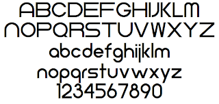
However, the most critical part of most design is the font selection. You can visit various sites like dafont.com, 1000fonts.com, or fontfreak.com to find some good fonts. This particular font was Neometric and was downloaded from DaFont. You can download it, if you like, by going here.
The coffee cup was created in Illustrator using various tools like the pen and pathfinder. I have created a step by step Illustrator tutorial for creating a basic graphic like this. It wasn't difficult, but you do have to know what tools to do in order to get the desired effect.
Some additional designs are shown below:

 9:31 PM
 T.L. Branson


 Posted in:


0 comments:
Post a Comment