Friday, September 28, 2012

How to Print Professionally

Multi-Function PrinterHave you ever made a design that you thought was going to be great, but then when you printed the file it came out all pixelated and blurry? Do remember being disappointed because it did not look as sharp as you had hoped it would be? This post seeks to help you avoid the woes of printing.


The All Important Rule
Any time you design a logo or poster for your church, make sure that the file is large enough for what you want done. Do you want a large 40" x 100" banner showcasing your church building project progress? Don't make the design on an 8.5" x 11" size document. When you go to print, the file will have to scale almost 10x it's original creation size and that will skew your design.

Notice the examples below:

Sermon Slide
4x6 Slide

40x60 Slide

Click on the 4x6 image. It's small, because that's the size it was created, and it's very clear. Now suppose I want that to be a super-size poster in my church. Click on 40x60 image above to see it full scale and notice how grainy and how bad the quality is. That is what happens when you scale your small raster to a larger size. For sake of being clear, this is what a portion of the file would look like printed out:


Another factor to consider is the files DPI, or Dots Per Inch. The average High Resolution image is about 300 DPI. If you are designing in Photoshop, you can set this yourself when you create a new document. If the file is originally a low DPI file (i.e. 72 DPI, the web standard), then your file will look like the picture above after scaling it two inches, let alone all the way up to 40"x60". The higher your DPI, the more pixels that are crammed into a square inch space. The more pixels in an each means it will stay clearer longer the larger you scale it.

Does that make sense? Therefore, if you plan to create something like this for your church, make sure the file size is the size of the desired print (i.e. 40"x60") and that your DPI is high enough for good quality (usually 300 DPI).

Okay, now let's talk about a potential solution.
 
I recently posted about the difference between Rasters and Vectors. Vectors prevent this problem. I said potential, though, because the image above cannot be a vectorsince  it contains a picture in the background and all pictures are rasters, that is they are made up of pixels.

However, using a vector allows you to take that small design and scale it to any size without any loss of information or clarity. This is the wonder of the vector image. Take a look at the examples below.

Screen Shot of  17" x 5"

Screen Shot of 70" x 18"

Click on each document to view them full size. You'll notice that there isn't a bit of difference in quality. That's the way vector works. Again, to full illustrate, take a look at a zoomed in shot of the 70" file below:


No pixelation. No blurriness. Only a beautifully clear logo.

Summary
All logos should be done in a vector format (Illustrator)
All pictures are raster because they're made of pixels
Make sure your file is large enough for your desired print
Use a High resolution DPI for printing

Can you think of any other printing tips regarding file size, raster/vector, or DPI that I did not mention? Feel free to share them in the comments box.

Vector Vs. Raster

Vector Vs. RasterWhat’s the difference between Raster and Vector? It’s pretty much like the difference between a $5 bill and a $100 bill. Which would you rather have? Obviously you’d want the $100 bill. It’s the same for rasters and vectors. For identity design, a vector is worth ten rasters. When it comes to logos and official church stationary you should never use anything but a vector.

Wait. Rewind. What is a vector anyway? A vector is an image that is based upon mathematical equations. It constantly calculates to give you the finest line no matter how far you zoom in. And a raster?

A raster image is one based upon pixels. A pixel is a tiny square of color information. Each pixel contains only one color. Thousands and thousands of pixels combined make a raster image.

The easiest way to tell the difference is by viewing the pictures below. The vector is on the right and the raster is on the left.

Logo at 100%
Logo at 300%
Logo at 6400%

So you see, a vector allows you to scale an image to any size you desire, and it still can be seen clearly. But vectors cannot be used for everything. If you design contains a picture, it will have to be raster because a picture is raster, or made of pixels. To learn more about working with rasters to receive the highest quality prints, check out my article: The Woes of Printing

Monday, September 17, 2012

Design a Coffee Cup Icon in Illustrator

Vector Coffee Cup
Yesterday I wrote an article about a logo I created for a new ministry at our church. I wanted to create a step-by-step tutorial to show you how I created the coffee icon for the logo.

If you have the Adobe Creative Suite, Illustrator is the program we will be using. A general rule of thumb, in case you are not familiar with it, is that InDesign is reserved for page layout, Photoshop for image editing, and Illustrator for logos and designs.

If you have not dabbled much with Illustrator, take heart, because neither have I. If you have a basic grasp of InDesign, Illustrator should come easy.

Start by opening and a new document and making it 10 inches by 10 inches.

The first step is just to create a circle. So take the Circle tool and hold shift to create a perfect circle. Fill it with Blue. If you want my exact color, the CMYK values are C=85, M=48, Y=0, K=0.


Now we are going to create the base of the cup. Find the Rounded Rectangle Tool, Click and hold on the Rectangle tool to reveal more options. You will find it there.

Begin to draw a rectangle. While you are still holding down the mouse button, tap the Up arrow key a couple of times. You will see the box begin to curve on the ends. Do your best to match the sample photo below. You do not want a complete circle because our cup is not a complete sphere. We want the bottom to be curved, but the top to be straight. Make the fill the same blue color and give it a white outline. You may need to adjust the stroke to make it thicker.


Now that you have our basic circle and rounded rectangle, create a generic rectangle that we are going to use to cut the cup shape in half. I changed my rectangle color to green just to show you the contrast. Place it at about the height that I did. You want a little bit of the straight edge of our rounded rectangle to show, but not too much because we don’t want a 5 gallon cup.
Next, find the Pathfinder palette. If you don’t already have it open somewhere, go to Window > Pathfinder. Selecting both the new rectangle we just made and our rounded rectnagle coffee cup, choose Subtract in the Pathfinder palette. It is the second option from the left. Then click Expand. Now we’ve got a circle and a cup.

Copy this cup layer and paste it in place on top of the current cup using Command + F, or go to Edit > Paste in Front. Invert the colors and turn off the now blue stroke to leave us with just a white fill. Shrink the new shape while holding Shift and nudge it slightly so that it leaves a small gap all the way around except at the top. Reference my picture below.

Now zoom in and add an anchor point to the middle of our new shape. Either press the plus key, or click and hold the Pen Tool to view more options. You want the Add Anchor Point Tool.


Using the Direct Selction Tool (White Arrow), nudge down the top left corner, our new point we just created, and the top right corner to match my image below. We want to create the effect of liquid inside the cup.

But liquid isn’t straight edged, it’s wavy, so we need to add a curve to our line. Now you need the Convert Anchor Point tool, it looks like a wedge. You’ll find it by clicking and holding the Pen Tool again and choosing the bottom option.


Click on our center anchor point that we added and, while holding down the mouse, drag out to give our anchor point some curve adjustment arms. Adjust these until you are satisfied with the wave of your coffee.

Now we need to create the handle for our cup. This is going to combine two tasks we have already completed for the cup so far. You need to create one shape based on a rounded rectangle for the handle.

Then copy and paste that shape, scaling it down and nudging it so that the handle maintains the same width from top to bottom. I have changed my second shape green for contrast.


Now substract it out using the Pathfinder palette and click Expand.


Next you need to duplicate the main cup body. Copy it and paste it in front with Cmd + F. Then bring it to the very front of the document by pressing Shift + Cmd + ] or going to Object > Arrange > Bring to Front.


 Select both the new cup body and the cup handle and use the Subtract tool again. Click Expand. Now your cup should look like this:


The final bit is to create the steam wisps. Zoom in above the cup. Take the Pen tool and make four anchor points. One at the top to start. Then click half way down to where you want to end, and, while holding the mouse down, drag out a curve. Now click a third point at the bottom. Create your final point in the middle to the side of your other point and make another curve. Complete it by clicking your original point to close the path.


Duplicate that shape twice, scaling one down slightly and the other even more. Space them out and you’re done.


You should have something that looks like this:

Sunday, September 16, 2012

SNAC Shop Logo

The latest design opportunity that I have had was to work on a few logos for our church. I hope that these logos will provide inspiration for you. I will also walk you through the steps I went through to create the logo. I will feature more of the logos that I created in the days to come. We'll start off with just one today.

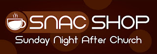
The first logo is for an upcoming event, the SNAC Shop. SNAC stands for Sunday Night After Church. The SNAC Shop will provide coffee and snacks after the evening service in the fellowship hall to promote church fellowship and raise money for the youth group.

Here is the finished product:


To begin. I searched the internet for various church logos to get ideas. Unless you've got an amazingly creative mind, searching for inspiration is essential. I often get ideas from looking at other works and putting my own spin on it and rarely have epiphanies that come to me out of pure ingenuity.

I search places like CreationSwap, ShareFaith, and Graceway Media. You can check out my review of each of these sites in a post I made several months ago.

I found this logo on CreationSwap and it was the basis of my idea for the coffee icon.
Music Cafe
The circle came based upon a series of info graphics I found on the web, and the rest of the "design" complimenting the circle was just from messing around to see what looked good with the same sort of a theme.

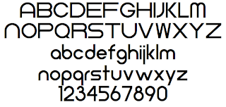
However, the most critical part of most design is the font selection. You can visit various sites like dafont.com, 1000fonts.com, or fontfreak.com to find some good fonts. This particular font was Neometric and was downloaded from DaFont. You can download it, if you like, by going here.

Neometric Font

The coffee cup was created in Illustrator using various tools like the pen and pathfinder. I have created a step by step Illustrator tutorial for creating a basic graphic like this. It wasn't difficult, but you do have to know what tools to do in order to get the desired effect.

Some additional designs are shown below:

SNAC Shop Logo

SNAC Shop Web Ad

SNAC Shop Web Ad

Monday, August 13, 2012

The Amazing Race: Mildura

A few weeks ago, while I was in Australia, we hosted a church Amazing Race teen activity. It was a great blast and a lot of work. We had three video cameras present and we tried to get as much of the race on film as possible. The final product is featured below for your enjoyment. I have also supplied the rest of our meager "designs" for you to look at too.

The Amazing Race
This was the envelope design. We printed directly onto envelopes. It wasn't difficult to make. Just use all caps, a black or thick bold font and mess with the letter height percentages in any Adobe program.

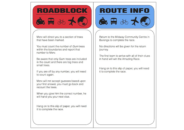
Route Info Clue
These were our clues. We printed them in black and white for sake of saving money on color, but I designed them in color. It was pretty easy. Just a bunch of rounded-corner boxes and I used wingdings shaped like travel icons for top. We had detours as well, but you can get the just of the design from this.

Most of the rest of the activity was just planning and organizing. That's the only design aspect. But don't let it fool you. Writing all of those and having them printed, then sealing them in envelopes is a lot of work! I hope this will be an inspiration for you to do a similar activity at your church! It's great fun!

Saturday, August 4, 2012

Free Book: Simple Church Giveaway

We are giving away one free copy of Dr. Thom Rainer's book Simple Church.

Recently I wrote and article about the book. Check it out here if you haven't read it yet.

This giveaway ends next Saturday, August 11, 2012 at Midnight Eastern Time.

Just enter in the widget below. Like us on Facebook, Follow us on Twitter, or post a Tweet to get extra entries. Then make sure you share this giveaway on Facebook (the widget should prompt you) to get an additional entry for each one of your friends that clicks your link.

Friday, August 3, 2012

Review of "Simple Church"

A few weeks ago, it was suggested that I read Dr. Thom Rainer's book Simple Church. I acquired the book as well as an extra copy (for a giveaway starting tomorrow).

By the authors' own admission, the book is "a nerdy research project" (243). What I found most humorous was shortly after that statement they write: "Normal people don't read church research books on vacation. We do. But we are not normal." And where was I when I was reading this book? On a plane on vacation. To that, the authors write "Welcome to the club."

However, don't let that give you hesitation. The book is a extremely practical church statistic book. The authors never meant it to sit on your shelf next to your church philosophy books and counseling books that you reference constantly for how to keep your church in the right perspective. They merely were reporting the findings of their research.

"But Traver, why is this book on a blog about graphic design?" Well let me tell you. It is because the book contains positive marketing principles applicable to your church both through design and ministry. The book begins looking at popular companies like Apple, Google, Southwest Airlines, and Papa Johns. These companies claim their success comes from their simple approach to design.

The whole premise of the book is "Simple is better." We've been duped into this mentality that "More is better" and "Complexity shows my skill." Instead, what society really wants is the point. They want to get to the point. In a society filled with microwaves, instant coffee and fast food, we don't want the extra garbage, just get to the point.

Some of the best design I have seen is clean. It shares the information you need to know, and adds nothing else.

Simple Church takes that philosophy and applies it to the church. The research project is then unfolded. Complex churches are cluttered with mission statements, philosophies, programs and directions. Each staff member has a different idea of what they want to accomplish and no one is in harmony. These churches have been found to struggle for growth, even if they are large to begin with, and report little development as a church. The pastor is frustrated and work is going no where.

The simple church, on the other hand, has one goal. One desire. They want to move people along a process toward spiritual growth. All of the simple churches have this general plan: "Win people to Christ, disciple them, and teach them to serve and share Christ with others." It's a three step process.

The simple church desires to move people along those various steps. The pastor constantly pushes that agenda, and every church member knows the philosophy. Each staff member is unified, and the programs of the church desire to further that cause. The church is vibrant and growing.

The proof, the method, and what to do are all found in the Simple Church. The authors are witty, funny, and make reading this book an enjoyable time. It's not a dry or dull experience, and the information is beneficial. You can pick up your copy of Simple Church at Lifeway.

Thursday, August 2, 2012

End Times Timelines

So where have I been the past month or so? Why haven't I been posting? Well the simple answer is I've been busy. The more detailed one is that I've been in two 2-week long intensive seminary classes as well as Australia for 3 weeks. You've received a few updates here or there about some design work that I have done in the process.

You might remember my post about the common take on Jude 22 "Making a Difference" being the wrong approach. You also might remember my Men's Conference Flyer for Murray River Baptist Church.

Well this is another one of those sort of posts. I'm currently in, and about to finish up, the book of Daniel in a Seminary class. Two of our class projects were to create a chart revolving around the Four Kingdoms of Daniel 2 and 7 as well as create a timeline for a Seventy Weeks of Daniel 9:24-27.

Our teacher showed us a generic Word document table with boring text and white boxes and I though to myself, "How about I make my chart look attractive." This has given me the idea of making charts like this in the future. I found this to be a practical and helpful project and I hope you find it helpful, too.

Feel free to use these if you desire. I made them pretty large (25"x19"). Just click on the picture to open the largest file.

The Seventy Weeks of Daniel timeline is pretty straight forward. It's a Pre-millennial timeline of events based upon Daniel 9:24-27. Yes, I am Pre-millennial. Yes, I disagree strongly about the other two views (A- and Post-).

The Seventy Weeks of Daniel Chart


The Four Kingdoms or Four Beasts chart is based upon Daniel 2 and 7. Though not directly stated in the chart, the image of Nebuchadnezzar contains the same four kingdoms. The head of gold, chest of silver, waist of brass, and legs of iron and clay are represented in that same order.

This chart contains all four views of this passage, though I only ascribe to the Pre-millennial view as mentioned above. There isn't much difference in the identity of the four kingdoms, but rather the difference is how the Kingdom of God plays in. The liberal view is just dumb.

The Four Beasts of Daniel 7

Do you like these charts? Would you like me to design some more End Times charts? I'm thinking about developing a complete End Times timeline based off of the Seventy Weeks chart. Would you find it helpful if I did this? Let me know. Your response will determine whether or not I put the time into it.

If you like this post, do me a favor and share it on Facebook. Let's get the word out about attractive and easy-to-understand Bible charts that make certain passages practical and profitable. As well as all the other design ideas on this blog!

Monday, July 16, 2012

Men's Conference Flyer

My activity here on the site has been low to nil recently, but in my day-to-day life I've been busier than ever working on two design items for Murray River Baptist Church as well as a host of other activities.

I'll talk about just one for today, and as I have time I'll talk about the other, which is a cool Teen Activity we are doing on Saturday.

The Men's Conference for Murray River Baptist Church this year is focused on a journey through the book of Proverbs. Pastor Steven Maldoff titled the conference "Wise Words from a Wise Guy." I needed to come up with a design that was both simple and clean as well as communicated that message of Wise Words.

Below is the design I came up with. I hope that it will be an inspiration to you, both to have a Men's Conference at your church as well as with the design for any of your materials.

Wednesday, July 4, 2012

Identities: Go Big or Go Basic?

This article is by Coreen Smith. Coreen is a freelance graphic designer. She specializes in church identities. That includes logos, letterheads, business cards, and envelopes. She is a good friend of mine from my graphic design classes in college and she is great designer. She does do more than just identities, though, so if you are interested head on over to her website at www.coreensdesign.com

Coreen also wrote an article earlier in the week that you should read first if you have not done so already. Check it out here.


When thinking about the options of going big, which is using a graphic designer, or going basic, which is doing the work in house or for your self, there are still key factors to keep in mind.

Going big does offer positives and negatives. Graphic Designers can be expensive, though not all are. When dealing with a designer, it is best to have some sort of concept in mind as to what you want the end result to be and what you plan to use your identity for before your meeting. This helps minimize your meeting time, gives the designer an inside view of your ministry’s vision, and how detailed and time consuming this project could be. Remember when using a graphic designer you are paying for their expertise and services. It also frees up your time to accomplish other things.

It is important for me to state that having a whole identity package (logo, business cards, letterhead, and envelopes) designed will give you more value for your money by bundling the work, rather than having each designed piecemeal. If you opt to use a graphic designer keep him or her informed of your plans and that you have a budget. Ask if there is any way you can get the most for your money or ask if they do ministry discounts. Just remember that if you never ask, you may never know.


The alternative to go basic by doing it your self does cut costs, but requires more time and involvement on the ministry’s side. The options vary from getting a free logo/identity  or buying one from an identity/logo site. The pit falls or down side to going to these sites is that you loose out on the custom individual look and run a greater risk in coming across other organizations that share your same identity.

Another option would be to place your organization’s name in a nice font with a clean appealing placement. (See my tutorial on Identity design made basic posted Friday.) This would take some time, but would eliminate having the same identity as another business and yet give you an individual look.

After weighing your options, walking through the questions, and deciding what route you might like to take; remember that an identity is an investment. No matter what option you choose, big or basic, your ministry will get good use out of it. You will have a good marketing foundation to build upon today and in the future.


Design by Free WordPress Themes | Bloggerized by Lasantha - Premium Blogger Themes | Best Web Hosting Coupons