Showing posts with label Advertising. Show all posts

Tuesday, March 19, 2013

Top 5 Font Tips for Great Design

I have finally begun to read The Non-Designer's Design & Type Books. I received it a few months ago to critique and have barely touched it. I first looked at it last night.

The opening pages discuss what the author calls the "Joshua Tree Epiphany." He tells the story of receiving a tree book for Christmas. Excited about his new book, he opened it, ready to identify the trees in his neighborhood. The first tree was a Joshua tree. He told himself he'd never seen one of those before. As he began identifying the trees in his neighborhood, he realized that 80% of the houses had Joshua trees in the yards.

The principle he was making from this story is that you tend not to notice something until you are aware that its there. I pondered this for a moment and immediately font styles popped into my mind. Since I have the eye of a designer, I see bad font choices everywhere. It's my hope that after reading this article you too will see it everywhere you go.

Tip #1 – No More Than Three Fonts
This is called the golden rule in font design. Never, under any circumstances, should you use more than three fonts. It is best to limit your designs to two fonts.


As a general rule, you only need one font for the headline and another for the body copy. Occasionally, you may desire a different font for a sub-heading or some other special piece of information. This is where the third typeface might come in. But please, for my sanity's sake, don't use more than three!

Tip #2 Make It Readable
If you go through all the effort to design an ad or flyer, make sure that the message can be read. Placing a picture behind the text or using the wrong color can ruin that message. Not only will your ad be hard on the eyes, but most people will be put off by the lack of professionalism.

I currently work as the designer for a Christian school yearbook. The ad to the right was designed by the company for our yearbook. It's a well-known and loved coffee shop in town, but the words are hard to read, making it an awful ad.

In addition to pictures, font style and color can also make an ad unreadable and unprofessional. Take a look at the example below and see for yourself. You can find these images and more examples like them at Photoshop Cafe.


Tip #3 Fonts Have Feelings
The style of font that you choose will drastically affect the way your message is received. You wouldn't use a block font for a wedding or a script font for an athletic gym. Take careful consideration of what feeling you want to communicate when choosing a font.

Do you want to be professional and authoritative? Choose a standard font like Arial, Helvetica, or Times. Do you want to fancy? Try Edwardian Script or some other script font. Do you need to make it look childish? Try a hand-drawn font. If you need more fonts check out DaFont or FontFreak for thousands of options.

 Here are a few examples to show you what NOT to do:
 There is nothing tough about this club,

 there is nothing peaceful about this place,

and there is certainly nothing reliable about this company.

Though not directly related to fonts, the text that you use is also important. Be sure to use proper English and avoid the use of exclamation points or all caps. IT MAKES YOU SOUND LIKE YOU'RE YELLING!!!

To the right is another ad from our yearbook. No!! body wants to buy from a car dealer who yells at you!! Don't scare away your customers before they ever walk through the doors.


Tip #4 Size Matters
How do you know what is more important if everything is the same size? The average body type is 12 points. The general rule of thumb is 14 pt. font or less for body copy and 18pt. font or higher for headlines. You can also use font size to differentiate the hierarchy of your body copy.


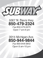
Take a look at these two examples from our yearbook. Notice how the one on the right shows all the text as the same size. I can't tell what I am supposed to be looking for. What's more important, what does the company want me to know? The ad on the left is far better at communicating the most important piece of information. It does this by being larger than the rest and by being bold.

Subway Text HierarchySubway No Hierarchy


Tip #5 More Isn't Always Better
Just because you have 20 features, doesn't mean you should list them. Now I admit, the example below isn't all that fair because Pizza Hut is a well-known brand and everyone knows what they have to offer. However, it still serves its purpose.

The Pizza Hut ad draws my eye, I see exactly what I was meant to see and all the information is communicated to me in a simple manner. The only thing that would make it better is color, and since this too is from our yearbook, you'll have to deal with black and white. The ad to the right wants to communicate all these brands they have in stock and all the different stores they have, but it's so cluttered my eye doesn't know where to go and what I should read first.

Pizza Hut Ad


The Bottom Line
 Great design isn't just creativity and concepts. You could have the best creative concept out there and absolutely fail because you chose the wrong font. Choosing the right font can easily become the most time consuming part of your design. When you find that perfect font, you'll know it and you'll be glad you spent the time to make your ad look awesome.

Do you have any more tips you'd like to share? It could be something that has always stuck with you. Maybe you learned it the hard way, or maybe you learned it by accident from just messing around with designs. Either way, I'd love to hear about it in the comments below.

Monday, March 18, 2013

The Cost of Good Design

Magnifying glass money
We just had our annual church business meeting. Immediately, some of you are falling asleep because that's what you do in business meetings, but here me out! In our meeting, and in most meetings, we passed around the church budget. One of the line items was "Advertising/Promotions." We even are starting a "committee" for this.

Like it or not Graphic Design has made its mark on the church. Church marketing cannot hope to live without it. So I asked myself this question "How much should a church be willing to spend on their Advertising campaign?"

To be perfectly honest with you, I have completely forgotten what number our church had down in the budget for this, but I hope to list many of the costs a church will need to undertake in order to be up-to-date on their design equipment.

This list will be broken down into Monthly/Yearly Expenses and One-Time Expenses. I will start with the latter because in the long run, they'll cost you the least amount of money.

One-Time Expenses
As a quick side note, all of these "one-time expenses" are more like "every 5-10 year" expenses, but that's a silly title. You will need to purchase these again, but not nearly at the monthly or even annual level.


Computer - $500-$1500
Now most churches have a computer. But I'm not talking about that old fossil
you bought 20 years ago. You need a good computer with plenty of hard drive space and RAM. What you buy is up to you. You want something that will last at least 5-10 years. Personally, I prefer a Mac. Now before any Mac haters out there start complaining about their price, most any designer will agree with me. Macs are superior for designers.

Truly, though, you should just ask the person who is planning on doing the design in your church. They may already have a computer that's good enough and you won't even need to buy one. However, it's not a bad idea to have a "design" computer that you know houses all your design resources. That way your not always looking for that flash drive or calling your designer to email you the file again.


Adobe Software - $500-1500
The pricing for this varies as well. If your church is also a Christian School you should be able to slip by purchasing the Academic version from a place like AcademicSuperstore.com. That will run you about $400. However, if you don't qualify for that, then you'll get stuck paying the big bucks for the Standard version. It needs to be done, though.

This purchase is a MUST. Even if your designer has his own computer, you won't be able to open any of the files he gives you without this critical software. You should plan to purchase a new copy of it every 3-4 versions. I still have Adobe CS2 on my laptop and my wife has CS3. Currently, Adobe is on CS6. It's been about 7 years since I purchased the programs. That's a relatively good amount of time.

The main problem is now going to be compatibility. CS6 will open CS2 files, but CS2 does not like CS6 because it has never heard of it. When your designer upgrades, it may be time to upgrade your software too.

*EDIT* See comments below for information regarding Adobe's new Creative Cloud which offers the programs of the Creative Suite at a monthly subscription fee.


Color Laser Printer - $500-$3000
This probably will be a one time purchase. If you buy a good enough printer you shouldn't need to buy a new one for many years to come. If you are tight on cash though, this little Lexmark wouldn't be too bad of an option. However, if you can afford and have the office space, a printer like this Xerox would be more heavy duty and would last longer.

Ideally, you want something that will print at least 11x17 size paper. The Lexmark listed above will not do that. You really should consider biting the bullet and making the big purchase.


Monthly Expenses
Website - $10/yr domains, $20/month hosting
Almost every church should have a church website. I have planned and still hope to cover websites in detail a little more in the future. Most domain names, that is the web address (ex. www.churchmarketingpro.com) cost about $10 a year. It's not a big fee, one you will hardly even notice. That said, your church should scoop up all domain names for your church.

Our church name is Pine Forest Estates Baptist Church. Our church address is pfebaptist.org. I have suggested to the church that we also purchase pfebaptist.com and pfebaptist.net. Com, org, and net are the big three web address types. If you purchase all three and set them to route to your main website, in our case pfebaptist.org, then even if someone types in .com on accident, they will still get to the right place.

Additionally, purchasing domain names like pineforestestates.com, pfebaptistchurch.com pfebc.com, etc. are all smart choices if your church has the budget for it. You want to monopolize your brand. Walmart wouldn't want people to mistype their address and end up at K-Mart's website. Just the same, you don't want a visitor ending up on some other church's website.


Design Service Subscription - $150/yr ShareFaith, $400/yr Graceway Media
I have talked about this at length in the past. You can visit this article for more information on which is better for your church. The short version is that ShareFaith has more to offer while Graceway does it better.
 

Stock Photos - $4-20/picture
Occasionally, designs will call for a high quality picture that you can only get from a stock photo website. Most of these photos are purchased with credits on an individual basis. Set up a church account on a stock photo website and check to make sure their credits don't expire. Then purchase a large pack as they generally offer the best deals.

When purchasing stock photos you will need to be smart. Don't purchase the cheapest photo, they won't be large enough for your design and you will ultimately be frustrated. At the same time, don't buy the largest file possible (that may be 30" wide) when you only need a 4x6 photo for a flyer.

This can make or break a design.

Printing - $50-100/job
Don't go cheap on printing. That's my one piece of advice. Go full color, none of this black and white stuff. I used to work at OfficeMax's ImPress print department. We had a sign that said "Color increases memory retention by 80%." Did you read that? Did it sink in? Color increases memory retention by 80%.

There's no reason not to go all the way. Use nice paper, use bleeds, get it professionally done. I'm not telling you to print a reminder about someone's baby shower in color, but if you're putting on a production or special event, get an ad printed properly.


The Bottom Line
So what's a good yearly budget cost? Crunching the numbers above, anywhere from $1,000-$2,500/yr depending on the abilities of your church. Anything less than $500 cripples your ability to do well, and I'm tempted to say anything below $1,000 will do the same.

Make sure you plan to strive for excellence in how your church is marketed and advertised.

Did you find this article helpful? Share it with your friends.
Do you have any other comments about cost? Post it below.
Do you have any questions about how much something should cost you? Ask away.

Thursday, October 18, 2012

Getting the Most from Newspaper Ads

Newspaper Advertisements
We have talked about advertising in the past. You can check out all the articles by hovering over the "Topics" tab above and clicking Advertising. Or you can just click here for you lazy people.

Today I want to get specific. I want to talk about Newspaper advertising. I've had a bit of experience with this working with Murray River Baptist Church and I was recently asked to design an advertisement for a local church, Resurrection Baptist Church of Pensacola, FL.


This got me thinking. Why don't I write an article helping others make great newspaper ads? There is a lot that goes into designing and placing an ad in the paper so the following information is a compiled list of everything you should pay attention to get the most out of your ad.

We'll start off basic and get to the most important stuff at the end.

Size
Advertisement sizes
Don't design your ad until you know what size it should be. It will be a nightmare to change an ad that you designed to be square when the newspaper needs one that's tall and skinny. Each newspaper will be different, check with you local news office for size requirements. Some ads will be square designs, others will be rectangular. Some will take up two columns, others will simple take up more vertical space in one column.

Each ad size will vary in cost. You don't have to buy an ad that fills the whole page, but don't be so cheap that your ad is the size of a thumbnail and no one can read it. That won't accomplish anything and you'll be wasting the $5 you did spend on the ad.

Color
If at all possible, pay extra for color if necessary. When I used to work at the ImPress department in OfficeMax we had a sign that said something along the lines of "Color improves recall by 85%." If you had a chance to improve your ads memorability by 85% wouldn't you want to pay that extra buck?

Placement
Get next to something that is highly read. Murray River Baptist Church has been next to the local movie theater's movie times for several years. You won't get front page coverage, so the best you can shoot for is next to something everyone looks for. You may not get a choice, but ask the representative to see what you can do about placement.

Design
The design is a tricky customer. This isn't your typical design. You need something clean, professional, but attention catching. Primarily white ads will not work here. Use a bold, strong color. Make sure it attracts attention. But don't use so much color it looks tacky. Look for that one color that makes the ad pop and stand out from the rest of the page. If you are using just black and white, then make sure your blacks are rich and pop so that you stand out among the other ads.

Make your phrase that you want to be remembered the largest thing on the page. Whether that's your church name, logo, or slogan. Maybe you want the most important piece of information to be your location. You have less than 2 seconds to grab the readers attention and even less than that to keep them.

Let's be realistic, most people do not look in the newspaper to look for church ads. Most people could probably care less about church. We're advertising to catch their interest and make them curious enough to come. Make sure what they see in those 3 seconds sticks with them and is enough for them to remember and get to your church.

Content
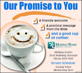
Let's face it, as I just said, most of the people you are trying to reach aren't going to be looking for your church. You want to write something that will be attractive. "Here are our service times" just does not cut it. Check out some of these slogans from Murray River Baptist Church. I did not create these and the images were taken off of Facebook so the quality isn't the greatest, but it's the slogans I want you to focus on.

Good cup of coffee

Wrestling with Something Big

Finding a Good Church

Murray River Baptist Church

The ultimate goal of advertising is to command attention, so do it. Draw the reader in. Make them want to come. Give them something they desire.

Getting someone to respond to your ad requires a few things. You must first command their attention. Once they are reading your need you have to present a problem or need. They need to realize they are missing something and you have it. Lastly, you must prompt them to action. If there is no charge to "Check us out" or "Come join the fun" or "See what's happening" then your response will be little.

Tuesday, June 26, 2012

From the Experts: Advertising Failures

Do you want to improve your advertising? The best way is to find out why advertising fails and learn from it. Have you heard that old saying "Those who do not learn from history are doomed to repeat it?" Read about why other people failed so that you don't have to. No one wakes up in the morning and says, "Today's a great day to fail at our new marketing campaign!" The best way to prevent from being a failure is to learn from others' (and your own) mistakes.

Here are some good articles to read about why advertising fails.

12 Causes of Advertising Failure by Roy Williams
Here are a few rather short ideas about why ad campaigns fail. They aren't long and are easy to read. It covers mostly common problems. I've noticed that a lot of these problems are rooted in impatience and selfishness. Take that out of the equation, and you'll likely have greater success. No one likes a selfish company.

7 Reasons Most Advertising Fails 
by Kirk Phillips
Kirk incorporates humor and is a little more specific than the previous article. While the above article gives more general blanket reasons, this article addresses specific problems. Most of it is not directly applicable to what a church seeks to do with its advertising, but the principles are still beneficial.

Marketing Mistakes 
by Peter Geisheker
This article offers extremely practical solutions. It tells you why a particular approach has failed and how to change it. The best way to understand a problem is to be given an example or an illustration. It's probably the shortest of the articles, but that certainly does not detract from it's value in understanding how not to fail.

Wednesday, June 6, 2012

Ten Dangers of Advertising

Dictionary Advertising
Advertising can be one of the most powerful media tools at a church's disposal. There are plenty of reasons why your church should be using advertising. However, there are also some dangers about advertising. If done the wrong way, advertising can actually harm your identity. Treat advertising like you would treat a visitor. Follow these simple instructions to avoid doing anything that would give people a wrong impression of your ministry.

1. Don't fake your success.
The following information is a summary of the article Blogging Can Be Disastrous. It proves that advertising that presents fake or falsified information will only lead to disaster. Don't advertise that you've got 400 people in wall-to-wall crowds on Sunday when your church only has 40 people in a room big enough to fill 200. It might attract visitors, but as soon as they arrive they'll realize you faked it and they'll tell everyone they know you were deceptive. You'll not likely get any more visitors. Ever.

Dr. Pepper failed in 2003 when it tried to advertise it's new product, Raging Cow. It was a new type of flavored milk. To promote it, they pulled in a bunch of teenagers and told them to go blog about it as if they had just discovered the milk and thought it was amazing. They were to act like consumers, not paid employees promoting their product. The scam was revealed and the product flopped.

In 2006, Wal-Mart also failed miserably doing the same thing. You probably know some people who are McDonald's or Wal-Mart fanatics. You know, the type that just have to visit every single store in every city they go to because it's some sort of game to see how many stores they can go to? Wal-Mart hoped to capitalize from this mentality. They hired two guys to travel around the country in an RV visiting every Wal-Mart. They were to then blog about their experiences, thus making Wal-Mart look as popular as places like Hollywood or Disneyland. It, too, was exposed, the blog disappeared off the web and Wal-Mart dealt with a lot of bad publicity.


2. Don't fix what isn't broken
If you've got an ad source that works. Keep it up. Don't try to change it because you think people are getting bored with it. When you stop receiving feedback from that source, then think about changing it.


3. Don't reinvent the wheel. Creativity isn't always the best.
Be careful how you advertise. Going way out on a limb will just have people confused and possibly put off by what you're doing. Stick with what works, but don't be afraid to put your own twist on it. Just keep it within reason.


4. Don't advertise based upon culture.
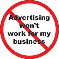
Advertising doesn't workThis is a strong temptation for a church. Many churches compromise their standards because they think they can attract the world by being like the world. Truth is, people are sick of the world and want something different. McDonald's advertised for culture with it's "I'd hit that" campaign and it failed miserably. Coca-Cola tried it with OK Cola. Ever heard of it? Not me either. The reason is that Coca-Cola attempted to release a new soda in 1993 based upon the OK Manifesto. Except there was no reason for it. They just attempted to be culturally cool.


5. Don't steal images, brands, or copyrighted information.
This should be a no brainer, but don't steal. Everyone knows you've done it. It doesn't look cool, and you'll lose your credibility. It's so tempting to do because that ad campaign was so largely successful.

Case in point: Church juice posted an article about stealing logos a few months ago. The author happened upon a church who tried to advertise ministry opportunities to it's members. It took Nike's slogan "Just Do It" and their logo and made it "Just Try It." It was a sad disgrace of an attempt. It's fun to do parodies every now and again, but make sure your obvious about the spoof. Don't try to look professional with someone else's work.


6. Don't sell more than you can offer.
Words like "Best Prices" are okay to say...if you can back it up. If you don't truly mean it, don't say it. We're churches. We represent God. Let's not lie to people in our advertising. You've all heard the grandiose promises of the candidates running for President, yet they fail to back up those claims. How does that make you feel? It doesn't give you greater confidence in the guy, that's for sure. Your church cannot afford to lose credibility and the confidence of the people around you.


7. Don't sacrifice your message for design.
Simple designs communicate better than flashy "attractive" ones. Graphic masterpieces and techno-gadgets are a thing of the 90s. In today's age, people relate good quality advertising to clean advertising. Some of the best websites are a simple white, yet they have an aura of power about them.


8. Don't advertise everywhere.
More ads in less places is better than less ads in more places. Simply put. If you have a chance to advertise on TV for one day, even if it's an ad during every commercial, and that's it, you're wasting your time. People will have forgotten you by tomorrow. But a newspaper ad that is seen every single day for years will attract more attention. Why? It's better to reach 10% of your audience 100% of the time than to reach 100% of them only 10% of the time (TheRadioStations.com).


9. Use testimonials instead of promotions.
If you can help it, the pastor should not be the one making the sales pitch in the ad. This doesn't mean the pastor can't be in it, but testimonials from every day people will go heaps further in the eyes of your viewers. Why? Because your biased, that's why. It's the truth. You've got so much time invested in it, you'd say your church was soaring if all it had were penguins (If you don't get that, don't think about it too hard...Penguins don't fly). Glad Tidings Omaha does this amazingly well. Check out their website and you'll be bombarded with testimonials from the home page.
Church Testimonials


10. Don't insult your audience.
You may think that your church has what everyone needs, but telling someone they're dumb if they don't go to church isn't the best way to get them to come. Instead, tell them what they do need. For instance, if you're trying to get smokers to stop smoking, you don't tell them "Only idiots smoke cigarettes." Instead, you show them what cigarettes do to your heart and lungs. Now obviously not everyone will respond to that, and not everyone is going to respond to your church ad.

Monday, June 4, 2012

Nine Reasons Every Church Should Advertise

Advertising
Ever wonder why companies like McDonald's and Coca-Cola spend millions on advertising when they're already so well established that it's impossible that no one has ever heard of them? It is just as important for the church to maintain an presence in advertising as it is for them. As a matter of fact, it may be more important for a church because of the importance of your mission, the saving of souls.

Chances are your church isn't advertising like it should be. You probably have several excuses, and some of them might actually be valid. "We don't have the funds for stuff like that," or "We don't have a good designer to make our ads." Certainly those are reasonable problems, but that doesn't mean you should just give up on advertising. Here are nine solid reasons why your church needs advertising.


1. It attracts new visitors.
The number one reason to advertise and the number one goal of your advertising should be to attract new people, specifically, the unsaved. Advertising actually has two main purposes. 1) Bring in the lost and 2) Draw in like minded believers. Now it shouldn't ever be our goal to steal folks from another good, Bible believing church, but if they come, they come. Your goal is to attract the lost, grab the attention of new people who have just moved to the area, and give folks a shining light to come to if they are currently in the wrong crowd.

2. Lack of advertising lowers your awareness.
Stock crashWhy do the companies that are popular stay popular? Because they're constantly putting their product in front of your face. TV commercials, bill boards, posters, signs at bus stops, etc. They pull out all the stops to make sure that you can't get them out of your mind. You could have the best product on the market, but if it is not advertised properly, it'll flop.

It amazes me how little churches put into advertising. Sure, they'll put an ad in the paper during Vacation Bible School because they want to attract as many kids as possible. Did your desire to attract people end when Vacation Bible School finished? Probably not. Then why should your advertising?

Advertising increases public awareness. Even if they never come to your church. Even if they never want to, advertising gets your name where it can be seen and heard. Word of mouth can be a powerful tool and keeping your name in the back of their mind is a great way to promote your church.


3. You have the greatest "product" to offer, Jesus Christ.
Some companies fail because they don't have great products. There is no greater thing in life than accepting Christ as Savior. You know it, and I know it, but the people don't. Our ads need to communicate that message. A recent article I read said that we need to focus less on telling people why we're better than the church downtown and start focusing on telling people why they need Jesus.  The article discusses the purpose of the Got Milk? ad campaigns. The purpose was not to prove their milk was better than their competitor's milk. The goal was to convince people to drink milk.


4. It gets your congregation excited.
Who doesn't want their church to get excited? Every time you put out a new advertisement, a new flyer, or church tract, tell your church. Bring the advertisement and show it to the congregation. People tend to be more excited about church when they see it making progress.

Suppose you attend the same church for 10 years and never see it do anything different. Every week is the same, they never make any progress, never have an building programs, never put on any events. Wouldn't you get bored after awhile? But when your church launches a new ad, it's something new, something interesting and piques people's interest.

Murray River Baptist Church launches a new newspaper ad every two weeks. I'm 10,000 miles away, and I look forward to seeing it posted to Facebook. When I see it, my eyes brighten and I click on the picture to take a closer look. It's exciting to see new advertisements and gets people involved.


5. It builds Authority, Reputation, and Confidence.
Reputation
When people see or hear a name constantly, they slowly begin to trust it. At first, the thought of randomly showing up at your church is something that scares them. Whether they think your service will be boring, are uncomfortable with the unknown, or just plain don't think they need Jesus. But as they are constantly made more aware of your name, they will become familiar with it.

They'll feel as if they've known you all along. Finally, the thought of visiting won't seem so scary anymore. If your advertising has accomplished its purpose, you'll even have them curious. So curious they can't not visit any longer.


6. It establishes your name and identity.
Identity is important for a church. It's who you are, what you are about, and how you show yourself to the community. In a couple of weeks, I've got a special guest lined up to share an article with you about building your church brand. It sounds weird to call it that, but your logo, letterheads, and business cards are critical for promotion, attraction, and recognition.


7. It gives you the opportunity to share your heart.
Nothing attracts new visitors more than seeing the heart and care of a church. They want to be wanted. They want to feel welcome and loved. Advertising gives you the opportunity to share testimonials of current members. Glad Tidings Omaha communicates this amazingly well on their website. Murray River Baptist Church featured different church members in their newspaper ad a few months back. It gives you the opportunity to tell the community: "Lives are being changed, yours can change too."


8. It shows community involvement.
Advertising lets the community know that you aren't a secret society. Many people have a misconception that a church is like a club. It's for its members and to become a member you have to be introduced by a current member. This thought creates a feeling of seclusion and separation between you and them. Advertising tells them, "Anyone can come, we welcome and appreciate you. Stop on by." It also tells them that you care about the city you live in, you care about the people around you. You aren't there to serve just a few "privileged" people.


9. It increases your ministry effectiveness.
This is more of a benefit of advertising than it is a reason, but benefits are reasons. More visitors means more people joining the church. More people joining the church means more people to volunteer for work and to participate financially with the church. More people participating means greater opportunity for expansion of your ministry.

Just a word of caution. This should not be the driving force of your advertising campaign. Notice how far down the list it is? Humble yourselves before God, praise Him, and He will lift you up. Never seek to lift yourself up, even if you do, it will be out of wrong motivation and God is not pleased with that.


If you are interested in Advertising ideas or saying "I'd love to do this, but I don't know how," then let me know in the comments below. I'd be more than happy to help you in any way I can.

Friday, May 11, 2012

What if Starbucks Marketed Like a Church?


So a couple months ago my pastor played the following video before our Wednesday evening church service and I was reminded of it recently. I'm posting it here because it's true and because it's not a bad idea to change up your service once awhile by showing something like this. Right now some of you are going, "*Gasp* CHANGE!?!?" Yes change. It's a good thing. Notice I didn't say compromise your doctrines or Biblical principles.


My pastor preached that night on being a church. You see a church is not just some rotary club or hangout. It's a living, breathing organism called the Body of Christ (I Corinthians 12:12-13). Christ accepted all kinds of people with open arms. He told the disciples, "Suffer little children, and forbid them not, to come unto me:" (Matthew 19:14). We're to be kind (Ephesians 4:32) and to show love (Mark 12:31) so that we might bear one another's burdens (Galatians 6:2).

Sometimes we look at visitors as invading our club. "How dare they sit in my seat. That's my seat." ...Don't look at me and tell me that you've never done that. I'll be the first to raise my hand. I'm guilty. Or we look at them as outcasts. "Look at that guy's clothes. Looks like he just came in from off the farm. Eww...and he smells like it too." How do you treat the guests of your church? Do they feel loved and leave with a desire to come back because they finally found a place where they can belong? Or do they make for the exit as soon as the pastor says "Amen" hoping they never have to darken the door of that church again?

Did this video made you think a little bit? Maybe you'll remember this the next time you see a visitor. Maybe you'll remember this the next time you go out of town and you are the visitor. What's your goal as a church? Is it to stay as this exclusive club that no one is allowed into or is to win lost people to Christ and encourage fellow brothers and sisters in Christ to keep on serving God with all their heart?

Would you like to share this with your friends? Click the links below and remind each other that church is about Christ.

Monday, April 9, 2012

Media Tip: Event Advertising

Advertise for everything (if you can afford it). Make a flyer, postcard, or bulletin insert for every major event. Events include: revival services, evangelistic events, dramatic productions, youth events, and special services (ie. Easter and Christmas). Bulletin inserts would be the cheapest route. All you need to do is make a half-sheet of paper, list the information for the event, print it two on a page, cut it in half, and put it in the church bulletin.

A postcard-size color advertisement would be ideal. It doesn't need to look pretty to accomplish its purpose (informing people of the event), but the nicer it looks the more attractive the event will be. Find someone in your church who is talented with Graphic Design to help out. You can print 4 on a page and make 200 for about $25 depending on where you get the printing done. OfficeMax, Staples, and Kinko's all do color printing. You can also get some great deals online if you are printing more than 500 from places like UPrinting

Then encourage your people to hand them to friends, neighbors, and relatives. Give them to the cashier at Wal-Mart or the waitress at the restaurant you are going to for lunch. You'll rarely get new people walking through your doors if you aren't inviting them, and special events are the best way to get them in. The folks that wouldn't normally come to a regular service just might come for that free Steak Dinner you're putting on as part of an evangelistic event. Psalm 126:6 "He that goeth forth and weepeth, bearing precious seed, shall doubtless come again with rejoicing, bringing his sheaves with him."

Below are some examples from my church, Pine Forest Estates Baptist Church. I didn't make these. They were created by a great professional Graphic Designer in our church.


Design by Free WordPress Themes | Bloggerized by Lasantha - Premium Blogger Themes | Best Web Hosting Coupons