My wife and I visited Answers in Genesis's Creation Museum today and we're going back tomorrow to finish up what we didn't get to today. I have only one reaction: Amazing. All of the exhibits are so finely crafted and the design work is phenomenal. As a matter of fact, I thought their design was so powerful, I wanted to share it with you, and give you some ideas for your church.
I show you this for one reason and one reason alone: It proves why you need media and design in your church.
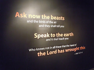
Answers in Genesis could have sat us all down in a big lecture hall and spent an hour telling us why the Bible is true, and why we ought believe what we do. They could have stood there behind a lectern interesting the intelligent few, boring the impatient most, and even putting a few to sleep. Instead, they gave us the same message in an interesting and attractive, easy to read poster.
While you may not be able to design this sort of thing, you are perfectly capable of displaying such a poster on your church projector through Powerpoint which you purchased and plan to use in the next month (Right? You did do that correct? If not, read this). If I have to repeat myself, it will increase the attention of your congregation and increase their learning and memory retention. That alone should be enough for you start using it as soon as possible.
The photo below kind of destroys the cleverness of the design. It's a clean black wall (yes, wall) with bright orange text. The light and exposure time kind of counteracts the effect.
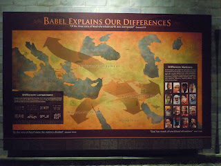
The following two pictures are great diagrams that would be perfect compliments for a series on Genesis 10-11. You could show something like this during the sermon itself.
Here is an interesting idea for church website. This is a virtual tour for the upstairs level of their dino exhibit. It's for those who can't make the steps. The Creation Museum also has a virtual tour on their website. I'm not sure how you'd do it, but you could google it. Creating a virtual tour for your website would allow people to get to see your church before they come. It may be counter productive and time consuming to make for a church, but I thought it was cool.
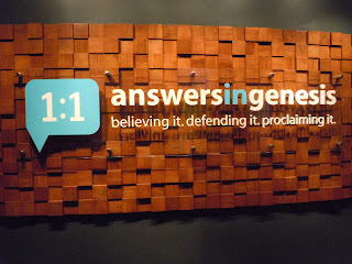
This is the importance of an identity. It's a clean design that says, "This is who we are." From this, you understand the focus on believing, defending, and proclaiming Creation. It's powerful and effective. My church has something similar to this just inside our church. Our logo is large and displayed hanging off the wall like the picture below. It's a great way to emphasize our identity as Pine Forest Estates Baptist Church.
These are posters, but they are great inspiration ideas for brochures and handouts. There's a nice welcome from the president. How about a nice welcome from the Pastor? You could place that right in the door of your church if you went with a poster, or hand it out as a brochure for advertising. Put it in the newspapers, get it out there.
"What do people need?" They need answers! AiG answers the questions about Creation. Maybe your church wants to run an ad about Answers, but they're answering to life's big questions and the Bible has the answer and your church is sharing those answers every Sunday.
Take some of these ideas and use them in your church. I'm serious. Don't just look at this and go, "Oh that looks nice," or "I wish we did something like that." Take the idea and run with it. An idea without action stays an idea, but an idea plus action changes lives.
Did you find this inspirational and motivating? Share it on Facebook to get your pastor and friends fired up, too. Have any other insightful comments? Let me know about them using the box below.

 5:00 AM
 T.L. Branson


 Posted in:


2 comments:
I have always been impressed with AiG's design. It's inspiring to see a Christian organization that goes to great lengths to appear attractive and professional. This "spirit of excellence" is lacking in so many ministries today, including churches. Sadly, this can hinder the outreach and effect that church or ministry might have if they presented themselves in a better way. Places like the Creation Museum show what can happen when time and effort are spent to create a stellar design.
Praise God for great design! :)
That's exactly why I started this blog in the first place. I wanted to share good, clean Christian design that presents Christ in a good way. Bad church design hinders the testimony of Christ. Why would anyone want to respond to a church ad that looks like it belongs in the 60s. Churches have a reputation for being old and stuck in the past and it's true most of the time.
We need to work hard at getting rid of that reputation and make church look fun and enjoyable and something that everyone should be involved with, not boring and old fashioned.
Thanks for your thoughts, Elise! I know you'll do your part in helping churches improve their design quality.
Post a Comment