Saturday, August 29, 2015

Fresh Start, Fresh Look


If you haven't heard the latest scoop, Media Missions is back in action....sort of. Since I decided to reboot the blog, I also decided to change the name. The old name was something I started with at the conception of the idea, but as I gained experience, I realized it wasn't as effective as I though it would be. Now, Media Missions was really all about church marketing, from advertising to printing and  social media to powerpoint, more than half of the topics drove home this one essential theme.

So it's with no small consideration that I bought a new website and rebranded Media Missions as Church Marketing Pro. The name is quite a bit more universal and provides a clearer focus moving forward. As I'm no web designer, I left the bulk of the website the same, while redoing the logo and updating the links on all the pages to reflect the new domain.

You can expect the first article to surface in the next couple of days. Until then, I will be continuing to make small updates that will largely go unnoticed, but are an effort to streamline the transition from website to another. Here's the full logo and title I designed for the new name.

Church Media

Wednesday, August 26, 2015

Media Missions Resurgence

and we're back
I haven't posted on this site for probably a little over two years, but through that time this website still receives 60+ clicks a day and receives comments from readers on posts at least once every 2 months. That's not bad for not one new post in 2 years!

With some new life circumstances (my wife's part time job), I find myself alone many nights without much to do. Now is the perfect time to bring back this site and try to push forward the original goal over 3 years ago when this site was started.


Thursday, May 23, 2013

Make Today the Best Day

Have you ever been standing at the check-out counter when the your transaction finishes and the cashier says to you "Have a good day!" and your typical response is "You too!"? We all have, it's our habitual response. But do you ever get tired of responding like a robot with hollow words? I mean come on, do you really, sincerely want that person to have a good day?

Recently, I was over at a gentleman's house and we were talking about unique ways to share the gospel besides knocking on someone's door. He pulled out his wallet and handed me a card. It said "Thank You! For saying "Have a great day!" and then proceeded to tell the reader why today was a great day. On it was the plan of salvation.

Immediately, I thought, "What an awesome idea!" Every time someone at the checkout counter says "Have a good day" or "Have a great day," he says, "I'm glad you said that!" and hands them one of those cards. I asked him if I could use the idea and he said sure.

Well I put my design-savvy to work and came up with an attractive card. I reorganized some of the wording and changed the main phrase. When someone tells you "Have a great day!" then pull out one of these cards and tell them it will show them have to have the best day of their lives. For the Christian, there is no greater day in our lives than when we placed our faith in Jesus Christ.

Below you will find two files. A front and a back. Click on each picture to open the full-size file and then save it. The design template came from www.gracewaymedia.com (Check out my article about Graceway). I have recently ordered 1,000 business cards from www.gotprint.com for $25 (shipping included). I received $5 off by Googling GotPrint.com Coupon Codes. I suggest doing the same. The files include a bleed and are upload ready. The web address on the cards is my ministry website. It contains doctrinal beliefs and a way to contact me.

Don't delay. Have some printed today and start sharing the gospel in a whole new way!


I know I ask this a lot and no one ever does it, but PLEASE share this with everyone you know. Share it on Facebook or tweet it, then print it and start handing it out.

Wednesday, March 20, 2013

The Hardest Design Lesson to Learn

Computer Frustration
Design is hard work. There is no question about that. It takes time, skill, and a lot of planning to pull off a great design. So what is the hardest design lesson to learn? Is it choosing that perfect font that communicates your message? Is it selecting the best color scheme that adds that extra flare? Or is it coming up with that creative concept that will blow the competition away?

While all of these steps in the design process are important. The hardest lesson for a designer to learn is to listen to the opinions of others. It echoes the age old principle, "The customer is always right."

Any designer knows that, to most non-design people, everything you do looks wonderful. In some cases, a customer's idea of a design gives you this strong desire to fix it and make your design despite what the client wants. Sometimes, the hardest thing for the designer, or even the client, to do is quench that desire and design with the audience in mind.

There are a couple of reasons for highly valuing how other people view your designs. The most obvious reason is to please the customer. If you, as a designer, tell a client, “Here’s my design, take or leave it,” then you won’t have many customers. The other reason has to do with how the design communicates.

This is where church design comes in. Churches don’t have clients. Oftentimes the designer is designing for the pastor, or maybe the pastor is the one doing the designs. When you design for yourself you receive no external input and, unless you make the effort to ask, you won’t get any either (at least before going to print, afterwards, you'll probably get plenty).

Let me paint an all-too-common scenario for you. As I have mentioned in the past, I am designer for a Christian school yearbook. Many times, I will come up with an amazing cover, fantastic new spread designs, and awesome layout concepts only to have them dissected and removed piece by piece by the administrator.

In those times, I’m tempted to think, “He couldn’t possibly understand the aesthetic features of such a bold and innovative design.” However, what I have learned is that if my design doesn’t communicate to him, it probably won’t communicate to my audience. What I thought was an awesome design, in reality, wasn’t as effective as it could be.

In order to achieve maximum effectiveness, show your designs to your spouse, your kids, your parents, your pastor, and anyone else who would come into contact with the design (within reason). Gathering input from a variety of age levels will help you create the design that communicates effectively to all audiences.

Let's do a brief exercise. Look at the picture below, but don't look at the text below it right away.


What was your initial reaction to each design? What first came to mind for the picture on the left? For me, immediately, Wi-Fi bars popped into my mind. The ad is about McDonald's offering Wi-Fi. That's successful communication.

What about the image on the right? My first thought is "dandelion" followed by"fireworks." However, the website I found the picture on says it's supposed to be a sucker cleverly designed as fireworks. Did anyone out there think this was a sucker? I asked a few people what they thought and no one saw a sucker. If that's what they were trying to communicate, they've failed. Effective design communication, that's what we're talking about.

I'm curious about your responses to our little exercise. Please feel free to leave your answers in the comments below.

Now, here's what you can do:
  • Ask for their initial reactions. (Most important)
  • Ask for their opinions.
  • Ask how they feel about it.
  • Ask what it says to them 

The Bottom Line
The hardest design lesson to learn is listening to the suggestions of others. If you can master suppressing the “my way or the high way” mentality then you’re one step closer to achieving success with your designs. It’s not easy. It may take some work, but you’ll be thankful for it in end.

What do you think about this?
Do you have a similar story to mine? Share it below.
Did you find this helpful? Chances are someone else will too. Share it with your friends.

Tuesday, March 19, 2013

Top 5 Font Tips for Great Design

I have finally begun to read The Non-Designer's Design & Type Books. I received it a few months ago to critique and have barely touched it. I first looked at it last night.

The opening pages discuss what the author calls the "Joshua Tree Epiphany." He tells the story of receiving a tree book for Christmas. Excited about his new book, he opened it, ready to identify the trees in his neighborhood. The first tree was a Joshua tree. He told himself he'd never seen one of those before. As he began identifying the trees in his neighborhood, he realized that 80% of the houses had Joshua trees in the yards.

The principle he was making from this story is that you tend not to notice something until you are aware that its there. I pondered this for a moment and immediately font styles popped into my mind. Since I have the eye of a designer, I see bad font choices everywhere. It's my hope that after reading this article you too will see it everywhere you go.

Tip #1 – No More Than Three Fonts
This is called the golden rule in font design. Never, under any circumstances, should you use more than three fonts. It is best to limit your designs to two fonts.


As a general rule, you only need one font for the headline and another for the body copy. Occasionally, you may desire a different font for a sub-heading or some other special piece of information. This is where the third typeface might come in. But please, for my sanity's sake, don't use more than three!

Tip #2 Make It Readable
If you go through all the effort to design an ad or flyer, make sure that the message can be read. Placing a picture behind the text or using the wrong color can ruin that message. Not only will your ad be hard on the eyes, but most people will be put off by the lack of professionalism.

I currently work as the designer for a Christian school yearbook. The ad to the right was designed by the company for our yearbook. It's a well-known and loved coffee shop in town, but the words are hard to read, making it an awful ad.

In addition to pictures, font style and color can also make an ad unreadable and unprofessional. Take a look at the example below and see for yourself. You can find these images and more examples like them at Photoshop Cafe.


Tip #3 Fonts Have Feelings
The style of font that you choose will drastically affect the way your message is received. You wouldn't use a block font for a wedding or a script font for an athletic gym. Take careful consideration of what feeling you want to communicate when choosing a font.

Do you want to be professional and authoritative? Choose a standard font like Arial, Helvetica, or Times. Do you want to fancy? Try Edwardian Script or some other script font. Do you need to make it look childish? Try a hand-drawn font. If you need more fonts check out DaFont or FontFreak for thousands of options.

 Here are a few examples to show you what NOT to do:
 There is nothing tough about this club,

 there is nothing peaceful about this place,

and there is certainly nothing reliable about this company.

Though not directly related to fonts, the text that you use is also important. Be sure to use proper English and avoid the use of exclamation points or all caps. IT MAKES YOU SOUND LIKE YOU'RE YELLING!!!

To the right is another ad from our yearbook. No!! body wants to buy from a car dealer who yells at you!! Don't scare away your customers before they ever walk through the doors.


Tip #4 Size Matters
How do you know what is more important if everything is the same size? The average body type is 12 points. The general rule of thumb is 14 pt. font or less for body copy and 18pt. font or higher for headlines. You can also use font size to differentiate the hierarchy of your body copy.


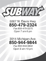
Take a look at these two examples from our yearbook. Notice how the one on the right shows all the text as the same size. I can't tell what I am supposed to be looking for. What's more important, what does the company want me to know? The ad on the left is far better at communicating the most important piece of information. It does this by being larger than the rest and by being bold.

Subway Text HierarchySubway No Hierarchy


Tip #5 More Isn't Always Better
Just because you have 20 features, doesn't mean you should list them. Now I admit, the example below isn't all that fair because Pizza Hut is a well-known brand and everyone knows what they have to offer. However, it still serves its purpose.

The Pizza Hut ad draws my eye, I see exactly what I was meant to see and all the information is communicated to me in a simple manner. The only thing that would make it better is color, and since this too is from our yearbook, you'll have to deal with black and white. The ad to the right wants to communicate all these brands they have in stock and all the different stores they have, but it's so cluttered my eye doesn't know where to go and what I should read first.

Pizza Hut Ad


The Bottom Line
 Great design isn't just creativity and concepts. You could have the best creative concept out there and absolutely fail because you chose the wrong font. Choosing the right font can easily become the most time consuming part of your design. When you find that perfect font, you'll know it and you'll be glad you spent the time to make your ad look awesome.

Do you have any more tips you'd like to share? It could be something that has always stuck with you. Maybe you learned it the hard way, or maybe you learned it by accident from just messing around with designs. Either way, I'd love to hear about it in the comments below.

Monday, March 18, 2013

The Cost of Good Design

Magnifying glass money
We just had our annual church business meeting. Immediately, some of you are falling asleep because that's what you do in business meetings, but here me out! In our meeting, and in most meetings, we passed around the church budget. One of the line items was "Advertising/Promotions." We even are starting a "committee" for this.

Like it or not Graphic Design has made its mark on the church. Church marketing cannot hope to live without it. So I asked myself this question "How much should a church be willing to spend on their Advertising campaign?"

To be perfectly honest with you, I have completely forgotten what number our church had down in the budget for this, but I hope to list many of the costs a church will need to undertake in order to be up-to-date on their design equipment.

This list will be broken down into Monthly/Yearly Expenses and One-Time Expenses. I will start with the latter because in the long run, they'll cost you the least amount of money.

One-Time Expenses
As a quick side note, all of these "one-time expenses" are more like "every 5-10 year" expenses, but that's a silly title. You will need to purchase these again, but not nearly at the monthly or even annual level.


Computer - $500-$1500
Now most churches have a computer. But I'm not talking about that old fossil
you bought 20 years ago. You need a good computer with plenty of hard drive space and RAM. What you buy is up to you. You want something that will last at least 5-10 years. Personally, I prefer a Mac. Now before any Mac haters out there start complaining about their price, most any designer will agree with me. Macs are superior for designers.

Truly, though, you should just ask the person who is planning on doing the design in your church. They may already have a computer that's good enough and you won't even need to buy one. However, it's not a bad idea to have a "design" computer that you know houses all your design resources. That way your not always looking for that flash drive or calling your designer to email you the file again.


Adobe Software - $500-1500
The pricing for this varies as well. If your church is also a Christian School you should be able to slip by purchasing the Academic version from a place like AcademicSuperstore.com. That will run you about $400. However, if you don't qualify for that, then you'll get stuck paying the big bucks for the Standard version. It needs to be done, though.

This purchase is a MUST. Even if your designer has his own computer, you won't be able to open any of the files he gives you without this critical software. You should plan to purchase a new copy of it every 3-4 versions. I still have Adobe CS2 on my laptop and my wife has CS3. Currently, Adobe is on CS6. It's been about 7 years since I purchased the programs. That's a relatively good amount of time.

The main problem is now going to be compatibility. CS6 will open CS2 files, but CS2 does not like CS6 because it has never heard of it. When your designer upgrades, it may be time to upgrade your software too.

*EDIT* See comments below for information regarding Adobe's new Creative Cloud which offers the programs of the Creative Suite at a monthly subscription fee.


Color Laser Printer - $500-$3000
This probably will be a one time purchase. If you buy a good enough printer you shouldn't need to buy a new one for many years to come. If you are tight on cash though, this little Lexmark wouldn't be too bad of an option. However, if you can afford and have the office space, a printer like this Xerox would be more heavy duty and would last longer.

Ideally, you want something that will print at least 11x17 size paper. The Lexmark listed above will not do that. You really should consider biting the bullet and making the big purchase.


Monthly Expenses
Website - $10/yr domains, $20/month hosting
Almost every church should have a church website. I have planned and still hope to cover websites in detail a little more in the future. Most domain names, that is the web address (ex. www.churchmarketingpro.com) cost about $10 a year. It's not a big fee, one you will hardly even notice. That said, your church should scoop up all domain names for your church.

Our church name is Pine Forest Estates Baptist Church. Our church address is pfebaptist.org. I have suggested to the church that we also purchase pfebaptist.com and pfebaptist.net. Com, org, and net are the big three web address types. If you purchase all three and set them to route to your main website, in our case pfebaptist.org, then even if someone types in .com on accident, they will still get to the right place.

Additionally, purchasing domain names like pineforestestates.com, pfebaptistchurch.com pfebc.com, etc. are all smart choices if your church has the budget for it. You want to monopolize your brand. Walmart wouldn't want people to mistype their address and end up at K-Mart's website. Just the same, you don't want a visitor ending up on some other church's website.


Design Service Subscription - $150/yr ShareFaith, $400/yr Graceway Media
I have talked about this at length in the past. You can visit this article for more information on which is better for your church. The short version is that ShareFaith has more to offer while Graceway does it better.
 

Stock Photos - $4-20/picture
Occasionally, designs will call for a high quality picture that you can only get from a stock photo website. Most of these photos are purchased with credits on an individual basis. Set up a church account on a stock photo website and check to make sure their credits don't expire. Then purchase a large pack as they generally offer the best deals.

When purchasing stock photos you will need to be smart. Don't purchase the cheapest photo, they won't be large enough for your design and you will ultimately be frustrated. At the same time, don't buy the largest file possible (that may be 30" wide) when you only need a 4x6 photo for a flyer.

This can make or break a design.

Printing - $50-100/job
Don't go cheap on printing. That's my one piece of advice. Go full color, none of this black and white stuff. I used to work at OfficeMax's ImPress print department. We had a sign that said "Color increases memory retention by 80%." Did you read that? Did it sink in? Color increases memory retention by 80%.

There's no reason not to go all the way. Use nice paper, use bleeds, get it professionally done. I'm not telling you to print a reminder about someone's baby shower in color, but if you're putting on a production or special event, get an ad printed properly.


The Bottom Line
So what's a good yearly budget cost? Crunching the numbers above, anywhere from $1,000-$2,500/yr depending on the abilities of your church. Anything less than $500 cripples your ability to do well, and I'm tempted to say anything below $1,000 will do the same.

Make sure you plan to strive for excellence in how your church is marketed and advertised.

Did you find this article helpful? Share it with your friends.
Do you have any other comments about cost? Post it below.
Do you have any questions about how much something should cost you? Ask away.

Thursday, October 18, 2012

Getting the Most from Newspaper Ads

Newspaper Advertisements
We have talked about advertising in the past. You can check out all the articles by hovering over the "Topics" tab above and clicking Advertising. Or you can just click here for you lazy people.

Today I want to get specific. I want to talk about Newspaper advertising. I've had a bit of experience with this working with Murray River Baptist Church and I was recently asked to design an advertisement for a local church, Resurrection Baptist Church of Pensacola, FL.


This got me thinking. Why don't I write an article helping others make great newspaper ads? There is a lot that goes into designing and placing an ad in the paper so the following information is a compiled list of everything you should pay attention to get the most out of your ad.

We'll start off basic and get to the most important stuff at the end.

Size
Advertisement sizes
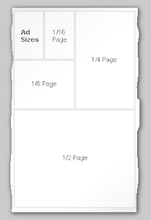
Don't design your ad until you know what size it should be. It will be a nightmare to change an ad that you designed to be square when the newspaper needs one that's tall and skinny. Each newspaper will be different, check with you local news office for size requirements. Some ads will be square designs, others will be rectangular. Some will take up two columns, others will simple take up more vertical space in one column.

Each ad size will vary in cost. You don't have to buy an ad that fills the whole page, but don't be so cheap that your ad is the size of a thumbnail and no one can read it. That won't accomplish anything and you'll be wasting the $5 you did spend on the ad.

Color
If at all possible, pay extra for color if necessary. When I used to work at the ImPress department in OfficeMax we had a sign that said something along the lines of "Color improves recall by 85%." If you had a chance to improve your ads memorability by 85% wouldn't you want to pay that extra buck?

Placement
Get next to something that is highly read. Murray River Baptist Church has been next to the local movie theater's movie times for several years. You won't get front page coverage, so the best you can shoot for is next to something everyone looks for. You may not get a choice, but ask the representative to see what you can do about placement.

Design
The design is a tricky customer. This isn't your typical design. You need something clean, professional, but attention catching. Primarily white ads will not work here. Use a bold, strong color. Make sure it attracts attention. But don't use so much color it looks tacky. Look for that one color that makes the ad pop and stand out from the rest of the page. If you are using just black and white, then make sure your blacks are rich and pop so that you stand out among the other ads.

Make your phrase that you want to be remembered the largest thing on the page. Whether that's your church name, logo, or slogan. Maybe you want the most important piece of information to be your location. You have less than 2 seconds to grab the readers attention and even less than that to keep them.

Let's be realistic, most people do not look in the newspaper to look for church ads. Most people could probably care less about church. We're advertising to catch their interest and make them curious enough to come. Make sure what they see in those 3 seconds sticks with them and is enough for them to remember and get to your church.

Content
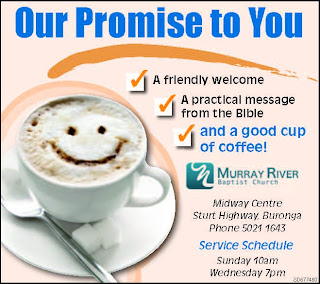
Let's face it, as I just said, most of the people you are trying to reach aren't going to be looking for your church. You want to write something that will be attractive. "Here are our service times" just does not cut it. Check out some of these slogans from Murray River Baptist Church. I did not create these and the images were taken off of Facebook so the quality isn't the greatest, but it's the slogans I want you to focus on.

Good cup of coffee

Wrestling with Something Big

Finding a Good Church

Murray River Baptist Church

The ultimate goal of advertising is to command attention, so do it. Draw the reader in. Make them want to come. Give them something they desire.

Getting someone to respond to your ad requires a few things. You must first command their attention. Once they are reading your need you have to present a problem or need. They need to realize they are missing something and you have it. Lastly, you must prompt them to action. If there is no charge to "Check us out" or "Come join the fun" or "See what's happening" then your response will be little.

Friday, September 28, 2012

How to Print Professionally

Multi-Function PrinterHave you ever made a design that you thought was going to be great, but then when you printed the file it came out all pixelated and blurry? Do remember being disappointed because it did not look as sharp as you had hoped it would be? This post seeks to help you avoid the woes of printing.


The All Important Rule
Any time you design a logo or poster for your church, make sure that the file is large enough for what you want done. Do you want a large 40" x 100" banner showcasing your church building project progress? Don't make the design on an 8.5" x 11" size document. When you go to print, the file will have to scale almost 10x it's original creation size and that will skew your design.

Notice the examples below:

Sermon Slide
4x6 Slide

40x60 Slide

Click on the 4x6 image. It's small, because that's the size it was created, and it's very clear. Now suppose I want that to be a super-size poster in my church. Click on 40x60 image above to see it full scale and notice how grainy and how bad the quality is. That is what happens when you scale your small raster to a larger size. For sake of being clear, this is what a portion of the file would look like printed out:


Another factor to consider is the files DPI, or Dots Per Inch. The average High Resolution image is about 300 DPI. If you are designing in Photoshop, you can set this yourself when you create a new document. If the file is originally a low DPI file (i.e. 72 DPI, the web standard), then your file will look like the picture above after scaling it two inches, let alone all the way up to 40"x60". The higher your DPI, the more pixels that are crammed into a square inch space. The more pixels in an each means it will stay clearer longer the larger you scale it.

Does that make sense? Therefore, if you plan to create something like this for your church, make sure the file size is the size of the desired print (i.e. 40"x60") and that your DPI is high enough for good quality (usually 300 DPI).

Okay, now let's talk about a potential solution.
 
I recently posted about the difference between Rasters and Vectors. Vectors prevent this problem. I said potential, though, because the image above cannot be a vectorsince  it contains a picture in the background and all pictures are rasters, that is they are made up of pixels.

However, using a vector allows you to take that small design and scale it to any size without any loss of information or clarity. This is the wonder of the vector image. Take a look at the examples below.

Screen Shot of  17" x 5"

Screen Shot of 70" x 18"

Click on each document to view them full size. You'll notice that there isn't a bit of difference in quality. That's the way vector works. Again, to full illustrate, take a look at a zoomed in shot of the 70" file below:


No pixelation. No blurriness. Only a beautifully clear logo.

Summary
All logos should be done in a vector format (Illustrator)
All pictures are raster because they're made of pixels
Make sure your file is large enough for your desired print
Use a High resolution DPI for printing

Can you think of any other printing tips regarding file size, raster/vector, or DPI that I did not mention? Feel free to share them in the comments box.

Vector Vs. Raster

Vector Vs. RasterWhat’s the difference between Raster and Vector? It’s pretty much like the difference between a $5 bill and a $100 bill. Which would you rather have? Obviously you’d want the $100 bill. It’s the same for rasters and vectors. For identity design, a vector is worth ten rasters. When it comes to logos and official church stationary you should never use anything but a vector.

Wait. Rewind. What is a vector anyway? A vector is an image that is based upon mathematical equations. It constantly calculates to give you the finest line no matter how far you zoom in. And a raster?

A raster image is one based upon pixels. A pixel is a tiny square of color information. Each pixel contains only one color. Thousands and thousands of pixels combined make a raster image.

The easiest way to tell the difference is by viewing the pictures below. The vector is on the right and the raster is on the left.

Logo at 100%
Logo at 300%
Logo at 6400%

So you see, a vector allows you to scale an image to any size you desire, and it still can be seen clearly. But vectors cannot be used for everything. If you design contains a picture, it will have to be raster because a picture is raster, or made of pixels. To learn more about working with rasters to receive the highest quality prints, check out my article: The Woes of Printing


Design by Free WordPress Themes | Bloggerized by Lasantha - Premium Blogger Themes | Best Web Hosting Coupons